# 移动端适配和一些功能槽点
const routes = [
  { path: '/protocol/sign', component: SignComponent },
  { path: '/protocol/:id(\d+)', component: ProtocolComponent } // 仅匹配数字 id
];
2
3
4
5
踩坑点: 如果路径参数 id 需要更具体的规则,可以通过正则表达式来限制 :id 的匹配,避免匹配到 sign
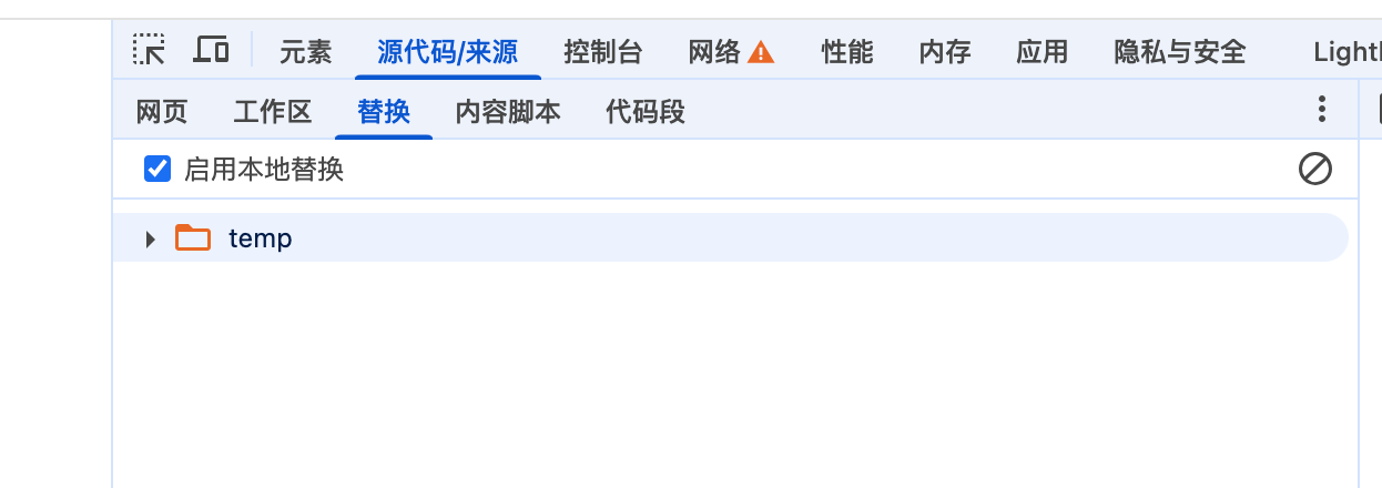
踩坑点: 浏览器的override 会缓存文件, 表现是 第一次加载的始终是本地缓存的文件, 而不是内存中的文件, override 的路径: source 下面和替换运行临时脚本的位置相同, 这是chrome 的一种文件代理方式
踩坑点: 移动端像素兼容方案
- [x] 方案1:
在需要 实现使用移动端的页面 添加样式
html {
font-size: calc(100vw / 3.75) !important;
}
设计图的宽度为375; 1px 转换为.0.01rem;
代码中是用相对单位: 0.16rem 就表示16px;
- [x] 方案2:
document.getElementsByTagName('html')[0].style.fontSize = `${window.screen.width / 3.75}px`;设计图的宽度为375; 1px 转换为.0.01rem;方案和上面是类似的, 代码中是用相对单位: 0.16rem 就表示16px;
- [x] 方案3: (建议方案)
document.documentElement.getBoundingClientRect().width / 10 代码来自于npm lib-flexible 包, 类似的包还有amfe/lib-flexible , 后者使用量要高的多, 以上代码设置html 的font-size: 37.5px
https://github.com/amfe/lib-flexible/tree/master,
https://www.npmjs.com/package/lib-flexible/v/0.3.2(无人维护)
umi2, 4 中配置px到rem 的转换
使用 postcss-pxtorem 这个npm 包;
  extraPostCSSPlugins: [
    require('postcss-pxtorem')({
      rootValue: 75, // 基准值(设计稿宽度 / 10),例如 375px 设计稿对应 37.5
      unitPrecision: 5, // rem 保留的小数位数
      propList: ['*'], // 需要转换的属性,`*` 表示全部转换
      selectorBlackList: [], // 不需要转换的选择器(可以写类名)
      replace: true, // 是否直接替换 px 为 rem
      mediaQuery: false, // 是否允许在媒体查询中转换 px
      minPixelValue: 1, // 小于或等于这个值的 px 不会被转换
    }),
  ]
2
3
4
5
6
7
8
9
10
11
12
// `Px` or `PX` is ignored by `postcss-pxtorem` but still accepted by browsers .ignore { border: 1Px solid; // ignored border-width: 2PX; // ignored }
代码中依然使用 px
- ‘ Px ’或‘ Px ’被‘ postcss-pxtorem ’忽略,但仍被浏览器接受