# 前端小技能
git branch --show-current 查看当前分支;
# 1.富文本转换成存文本
参考文档地址: https://developer.mozilla.org/zh-CN/docs/Web/API/DOMParser
function getTextFromHtml(html: string):string {
    try {
        const doc = new DOMParser().parseFromString(html, "text/html");
        return doc.body.textContent || "";
    } catch (err) {
        return "";
    }
}

function extractPlainText(html:string): string {
    const container = document.createElement('div');
    container.innerHTML = html;
    const textContent = container.innerText;
    container.remove();
    return textContent;
}
1
2
3
4
5
6
7
8
9
10
11
12
13
14
15
16
2
3
4
5
6
7
8
9
10
11
12
13
14
15
16
# 2. 多行省略的样式
如果不生效, 请注意检查是否使用了less 等css编译工具将前缀给去掉了
 .multilineEllipsis {
    display: -webkit-box;
    -webkit-line-clamp: 3;
    /* 限制最多显示 2 行 */
    -webkit-box-orient: vertical;
    overflow: hidden;
    text-overflow: ellipsis;
    word-break: break-word;
    /* 避免单词超出容器 */
 }
1
2
3
4
5
6
7
8
9
10
2
3
4
5
6
7
8
9
10
# 3.主题色的动态换肤实现方案
className={classNames(cls.container, {
[cls.hxkt]: window.IS_HX,
[cls.jjxt]: window.IS_JJXT,
[cls.spt]: window.IS_SPT,
})}
.hxkt {
  --theme-color: #3377ff;
}

.jjxt {
  --theme-color: #ffa41b;
}

.spt {
  --theme-color: #3377ff;
}
1
2
3
4
5
6
7
8
9
10
11
2
3
4
5
6
7
8
9
10
11
子组件中需要用到主题的地方使用
.questionTypeTag {
         display: inline-block;
         border-radius: 4px;
         font-size: 20px;
         color: var(--theme-color);
         line-height: 36px;
         height: 36px;
         padding: 0 12px;

          // 通过伪类的方式实现透明度颜色
         position: relative;
         &::before {
                content: "";
                position: absolute;
                top: 0;
                left: 0;
                width: 100%;
                height: 100%;
                background-color: var(--theme-color);
                opacity: 0.1;
                /* 设置透明度 */
                z-index: 1;
            }
     }
1
2
3
4
5
6
7
8
9
10
11
12
13
14
15
16
17
18
19
20
21
22
23
24
2
3
4
5
6
7
8
9
10
11
12
13
14
15
16
17
18
19
20
21
22
23
24
换肤的时候动态改变 根节点的 变量
在less 中的方案是定义一个基础的 @themeColor: #fff;
使用的地方用变量, rgba 采用 fade(@themeColor, 10%)这种写法
[奶茶]
# 4.常用公式分割配置
window.MathJax = {
    tex: {
        inlineMath: [['$', '$'], ["\(","\)"]],
        displayMath: [['$$', '$$'], ['\[', "\] "]] // 定义块级公式的标记
    }
};
1
2
3
4
5
6
7
2
3
4
5
6
7
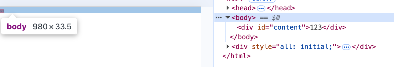
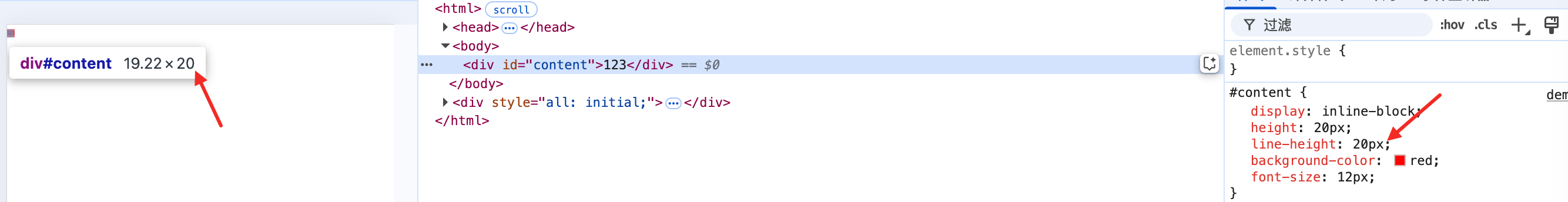
在html 中, 如果没有设置字体大小, 则字体大小继承body的字体大小, rem 是以根节点html 的字体大小来计算的, em, 是以body的字体大小来计算的,
如果一个div节点显示成了display-inlineblock, 那么就算设置的高度, 但是依然会撑开父容器的高度,但是呈现的高度不是父容器内部的高度
<!doctype html>
<html>

<head>
    <meta content="width=device-width, initial-scale=1, viewport-fit=contain"  charset="utf-8"  />
    <title>demo</title>
</head>
<style>
    html {
        font-size: 37.5px;
    }
    body {
        font-size: 24px;
        margin: 0;
    }
    #content{
        display: inline-block;
        height: 20px;
        line-height: 20px;
        background-color: red;
        font-size: 12px;
    }
</style>


<body>
    <div id="content">123</div>
</body>

</html>
1
2
3
4
5
6
7
8
9
10
11
12
13
14
15
16
17
18
19
20
21
22
23
24
25
26
27
28
29
30
2
3
4
5
6
7
8
9
10
11
12
13
14
15
16
17
18
19
20
21
22
23
24
25
26
27
28
29
30
body的高度约为24 * 1.4, 意思就是body 里面的div 变成了行内元素, 高度等于字体大小* 行高, 不在是由里面的内容撑开父容器的高度, 里面的优先级更低, 所以20 不生效, 但是里面的元素渲染的高度20 是生效了的